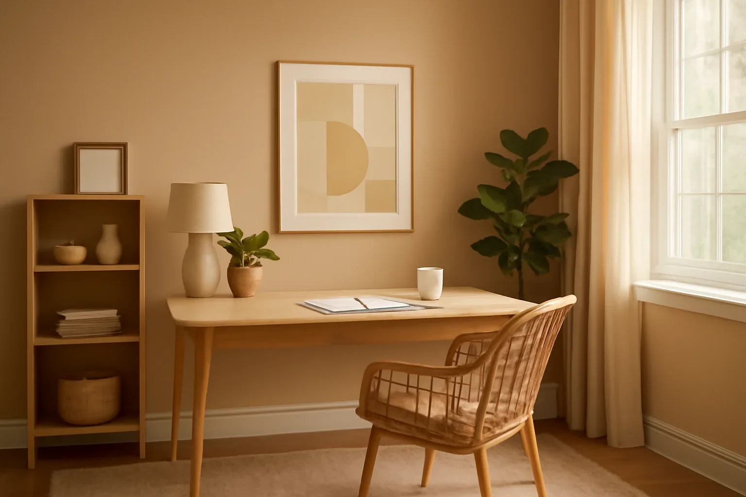
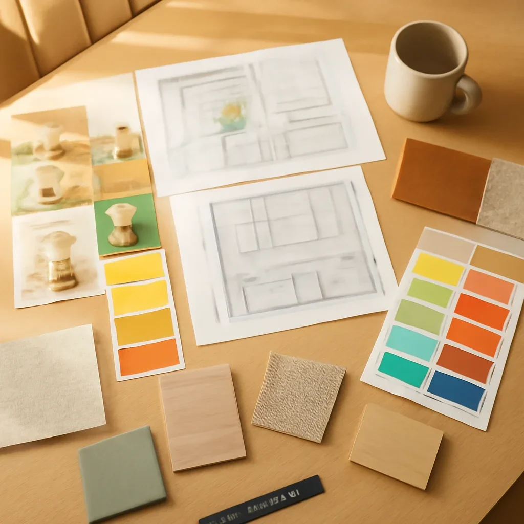
Use brightness strategically
Bright does not have to mean loud. A room can feel uplifting through soft contrast, natural light reflection, and a few clean color moments rather than one high-saturation wall.
- Whites and pale neutrals need undertone control.
- A soft color on millwork or accessories can energize the room without dominating it.
- Reflective finishes can help amplify light in darker offices.
Balance alertness with calm
A workspace that feels too muted may be uninspiring, but a palette that is too active can quietly drain concentration. The goal is a room that feels awake and steady at the same time.
- Blue-green tones often support focus.
- Warm whites and pale clay tones can keep the room human and comfortable.
- Use black or wood accents for structure.
Support the way you work
Your screen setup, storage needs, and background for calls should all influence the palette. The room is not just there to look good in photos.
- Think about glare and artificial lighting at your desk.
- Choose colors that flatter the room on camera if you use video calls often.
- For a full workspace plan, explore home office interior design.