Why complementary color feels dynamic
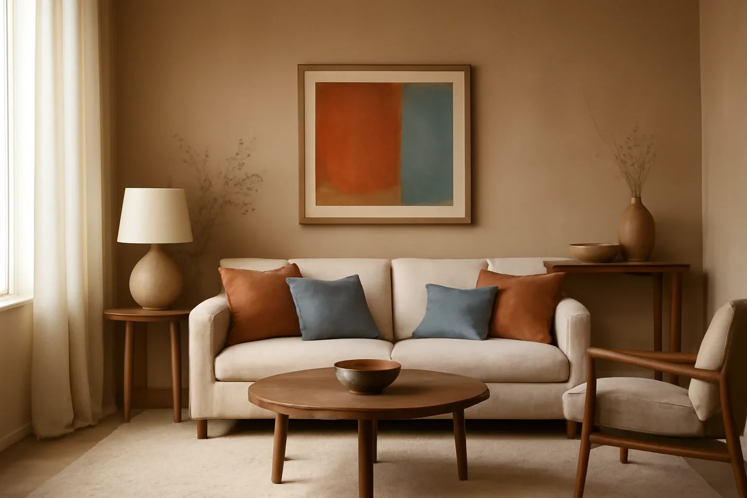
Opposing hues sharpen each other. A room with blue and warm orange notes, or green with red-leaning accents, can feel more dimensional because each color has something to play against.
- Keep one color dominant and use the opposite as an accent.
- Use muted versions when you want sophistication instead of high contrast.
- Bring the contrast in through art, textiles, or smaller pieces first.
How to avoid overdoing it
Strong complementary pairings can become tiring when both colors appear at the same intensity. The room needs hierarchy so the contrast feels deliberate, not loud.
- Use neutrals to separate the strongest moments.
- Limit the brighter hue to focal points.
- Repeat the accent tone enough to feel intentional, but not everywhere.
Make contrast feel refined
The most successful rooms use complementary color in a controlled way. Texture, natural materials, and a steady lighting plan help the palette feel elevated.
- Let surfaces stay calmer when accessories are bold.
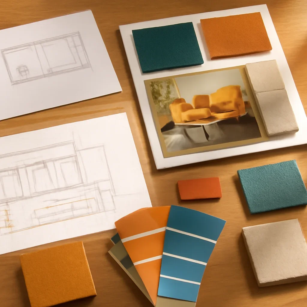
- Test colors at different times of day.
- For a room-specific palette that still feels practical, explore color consultation support.