How analogous palettes create harmony
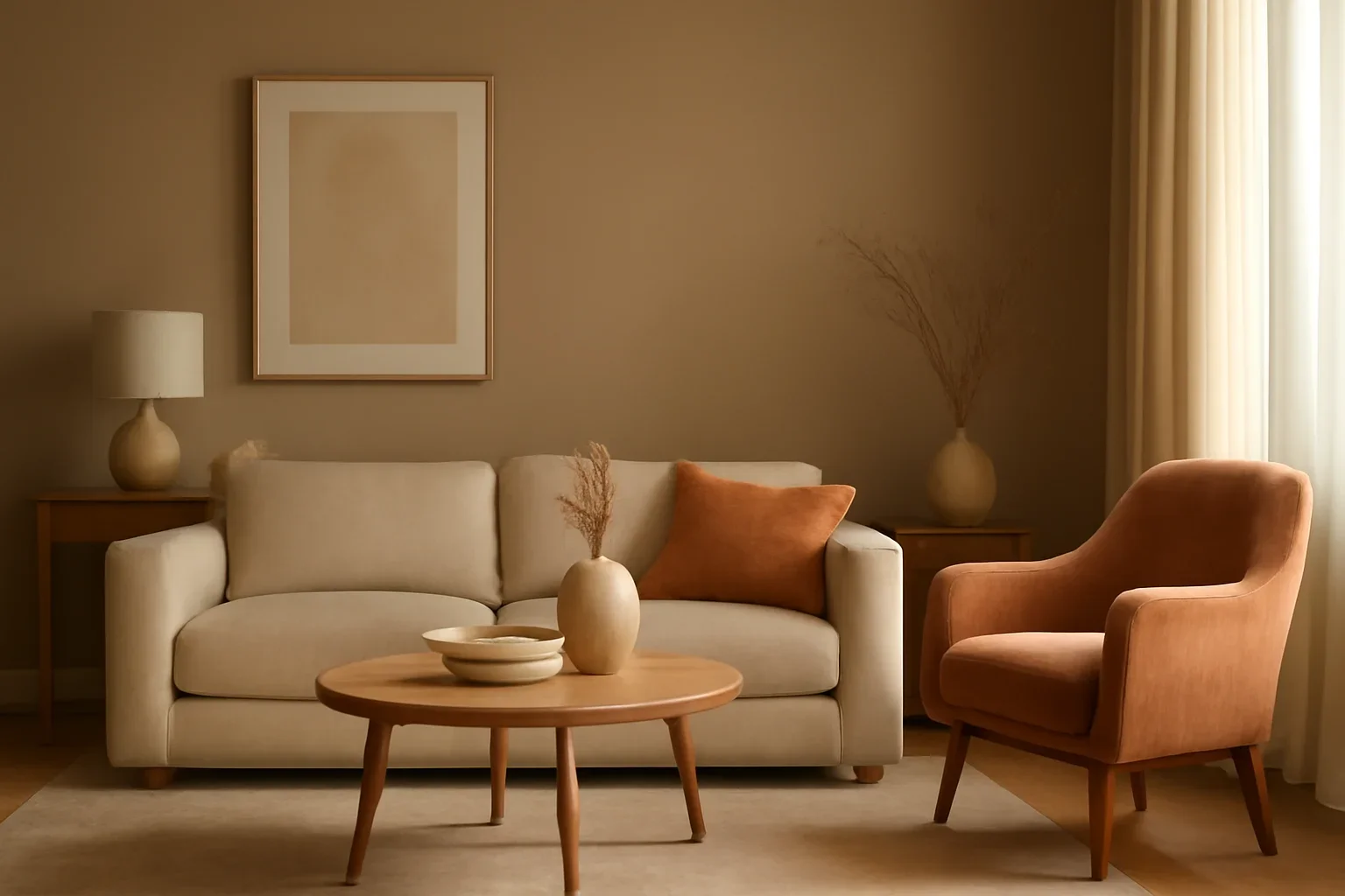
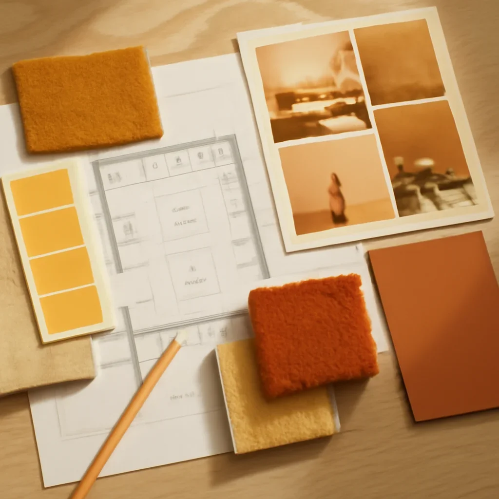
Because the colors already share visual DNA, they blend easily in walls, textiles, artwork, and smaller accents. This makes the palette feel layered without becoming busy.
- Choose one dominant color and let the others support it.
- Use a neutral to give the palette breathing room.
- Keep saturation levels similar for a calmer result.
Best rooms for this approach
Analogous schemes work especially well in living spaces, bedrooms, and open rooms where you want flow from one zone to another. They are useful when the room should feel gentle rather than dramatic.
- Blue-green combinations often feel airy.
- Green-yellow combinations can feel fresh and grounded.
- Muted versions of warm adjacent tones can add warmth without heaviness.
Keep the palette intentional
The risk with analogous color is letting it drift into sameness. The room still needs a focal tone and enough variation in material and scale to feel designed.
- Let one color lead on larger surfaces.
- Reserve supporting tones for textiles, art, and smaller furniture pieces.
- Pair this approach with a whole-home palette strategy if adjacent rooms need to relate.